Forty Acres Catering
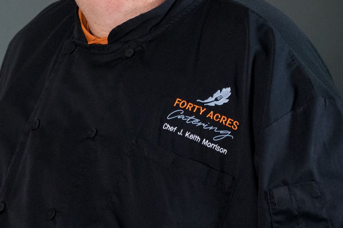
This identity and icon was created to showcase the expanded catering services at the university. The client desired a logo that stood apart from the standard university wordmark. However, it was required that the identity still reflect the university brand guidelines. The solution we came up with features the university burnt orange, the secondary gray color and the primary university font. The logo appears on the chef’s coat as well as menu display signage.